Well, I'm all moved into my new office space, and while my studio is always a "work in progress," I thought I'd share a few pics with you!
This is an unusually shaped space in the farthest reaches of our basement. The floor is tile, the ceiling cedar paneling, and there is built-in storage galore. I love all the storage, however, it did pose a challenge of where to put things, specifically furniture that's normally up against a wall. The L-shaped room consists of 6 walls:
1) One wall covered with 6 doors (above) with access to storage shelves,
2) another wall is the entrance to the furnace room with a built in cabinet next to it,
3) One wall has a regular door to the back yard and a set of sliding glass doors with another built-in cabinet between them,
4) The shortest wall is just wide enough for the entrance to the office,
...which leaves me with walls 5) and 6) to put furniture against: One of those walls is painted brick, so there is literally one wall with drywall on which to hang things.
AFTER....
Aaaah....a cool space with a function and purpose!
Above you see the one wall where I could hang things, which is where I hung my zig-zag shelf, flat shelf/countertop, and clock. That pretty much dictated where my bookshelf and desk could sit, which worked out fine, as I now face out the sliding glass doors and view of the lake while sitting at my computer.
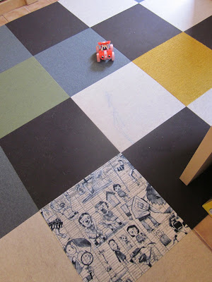
The carpet tiles I got from Flor really softened up the space. I wanted something that I could change if I wanted to, and easily replace as needed. Being that kids are in here too, and the dogs go in and out of the house through my office door, the ability to replace stained tiles was a must. They are also nice and smooth, which works great for my rolling desk chair.
I of course kept my kid-friendly goals from my previous studio space re-design. (Wow, it's weird to look back on that post when I'm pregnant, with the now 1.5 year old who's shown above!)
To help better utilize all of these walls that couldn't have furniture against them, I looked for other ways to make the surfaces work for me.
I used some peel-and-stick dry erase board material to cover one of the large storage units. It went on great, although a day later started to bubble. I'm still trying to flatten bubbles daily, so it was a little disappointing, but a perfectly flat wall may accept the covering better than this wood storage unit.
I also bought some peel-and-stick chalkboard surface, which is really just black Con-Tact paper, but it worked great. I stuck squares of it on the wall, and also used it to wrap some cabinet fronts on my bookshelf. (I got these cabinet door units in the as-is section for $5, but didn't want them to be red anyway, so this was a great fix!)
On the wall behind my desk I hung some cork squares, a square of dry erase stuff, a square of chalkboard, and a little note holder. Turned on end as diamond shapes, they fit under my zig-zag shelf perfectly, and the squares tie in nicely with the squares on the floor.
The wall above my drawing board is painted brick, so it's harder to hang things. However, I found that 3M's exterior mounting adhesive worked perfectly to mount these cork squares. I left spaces between them to continue with the recurring square theme.
The wall of doors I am now using for various things...I hung my white boards here, and mounted some more cork to fit within the door panels. Someday when I'm rolling in cash and don't know where to spend it, I'll get myself some giant white board panels that fit the size of each door. But, until then, my thrift store white boards work just fine!
The 1/4" thick cork is easy to cut with an X-acto blade, and was a great choice to fit within the panels on the door. 3M's Command hooks worked great here as well, to hold my T-squares. I've added more since these photos were taken.
What narrow strips of vertical wall surface I had left on "the wall of doors" I utilized as well. Here I screwed in some steel strips that I could attach my magnetic storage jars to.
The other strip of "wall" had a recessed area, which just screamed "state fair photo booth frame" to me!
While unpacking I came across a little collection of fortune cookie fortunes, and discovered that the clear plastic corner guard made a perfect little spot to "frame" them! For some reason I just can't ever bring myself to throw away those little fortunes. (Maybe it's because the day before my husband proposed, I got one that read "you will be married within a year.") ;-)
Painting the ceiling white really brightened the space in a major way. The ceiling has dropped areas, and I found a couple little ledge shelves at thrift stores that fit perfectly across a couple lengths, giving me space for storage of small items and knick-knacks.
I am really loving my new space now. For me, the ceiling and floor treatments were what really transformed it from an awkward basement space to an enjoyable space to be in, and one void of old, bad, distracting design decisions. Now I am just free to crank out sweet designs for my awesome clients! I am truly blessed to be in my dream job, working for myself from my own home studio with a view! Thanks for stopping by.


No comments:
Post a Comment